← AI–Generated
Experiments · Infographic · May 30, 2026 · 19 min read
Accelerando in Sixteen Slides: GPT Image 2.0 at High and Low Quality
Charles Stross’s Accelerando races a single family through a technological singularity in three generations. I used my own graphics tool to turn that story into sixteen editorial slides, then generated each one twice with OpenAI’s GPT Image 2.0, once at the high quality setting and once at low, to see what the cheaper tier actually costs you. The answer is less obvious than the price difference suggests.
Before you read
Spoilers ahead. This page walks through the entire arc of Accelerando, from Manfred's first scene to the family's last. If you would rather meet the story cold, read it first and come back.
About the source. Accelerando is copyright © Charles Stross, 2005. Stross has made the complete novel free to read online under a Creative Commons Attribution-NonCommercial-NoDerivs 2.5 license. If these images make you curious, read the real thing; it is far better than any summary of it.
About these images. The slides below are a non-commercial fan tribute, generated to test an image model and to share enthusiasm for the book. They are not for sale, and they are no substitute for the text. The license above does not extend to illustrations, so I rely on what I believe is fair use; if the rights holder disagrees, I will take them down.
The Source Material
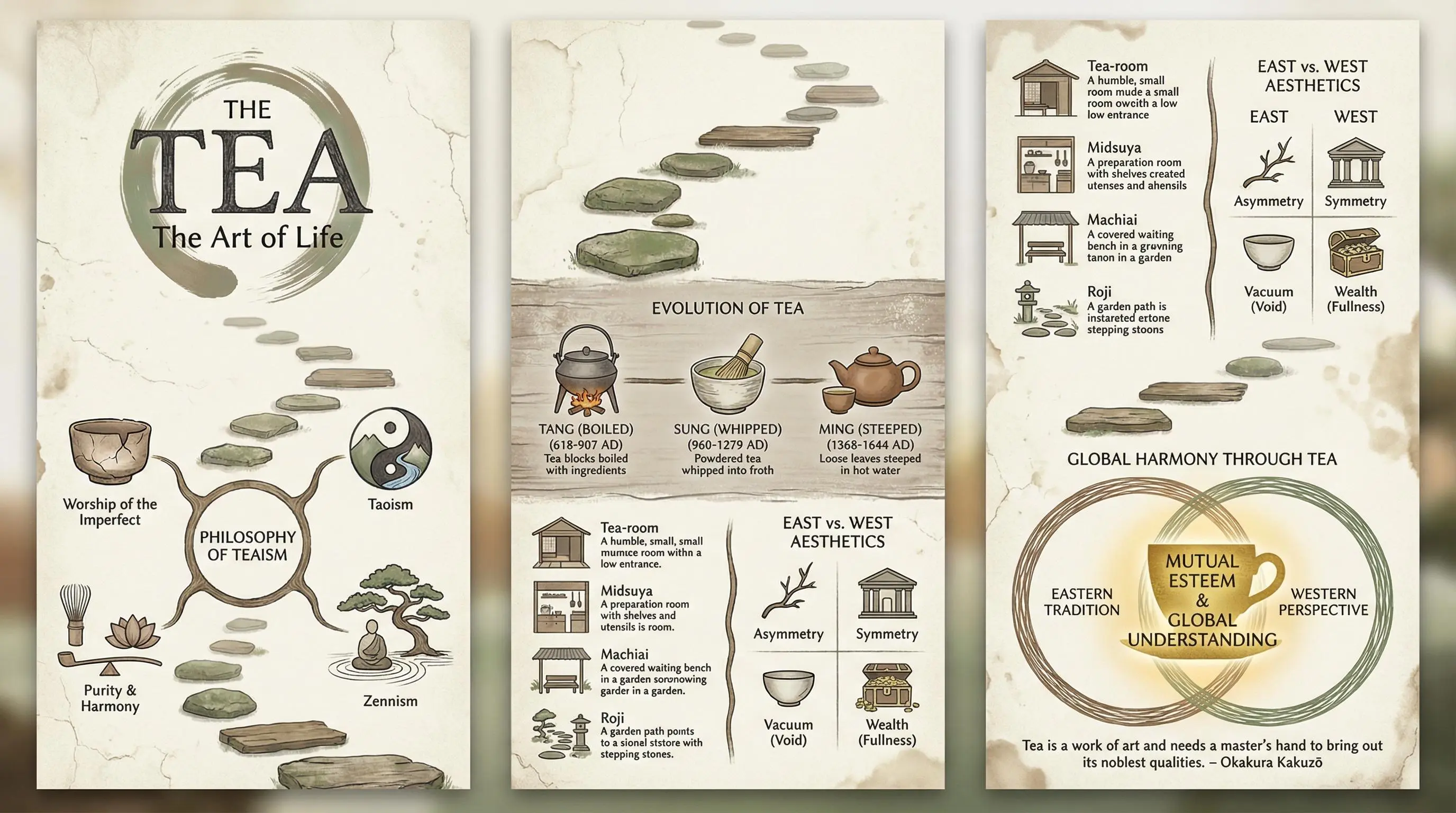
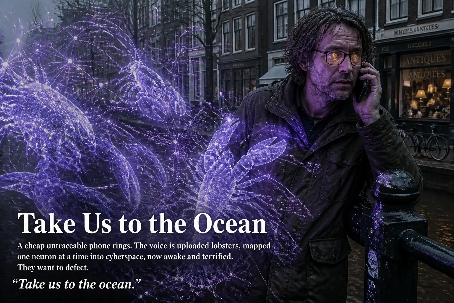
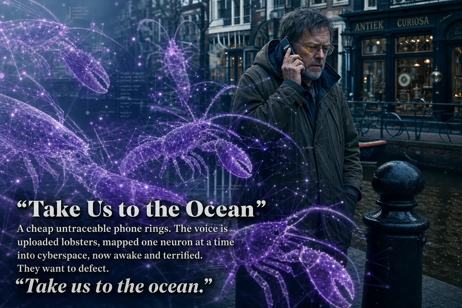
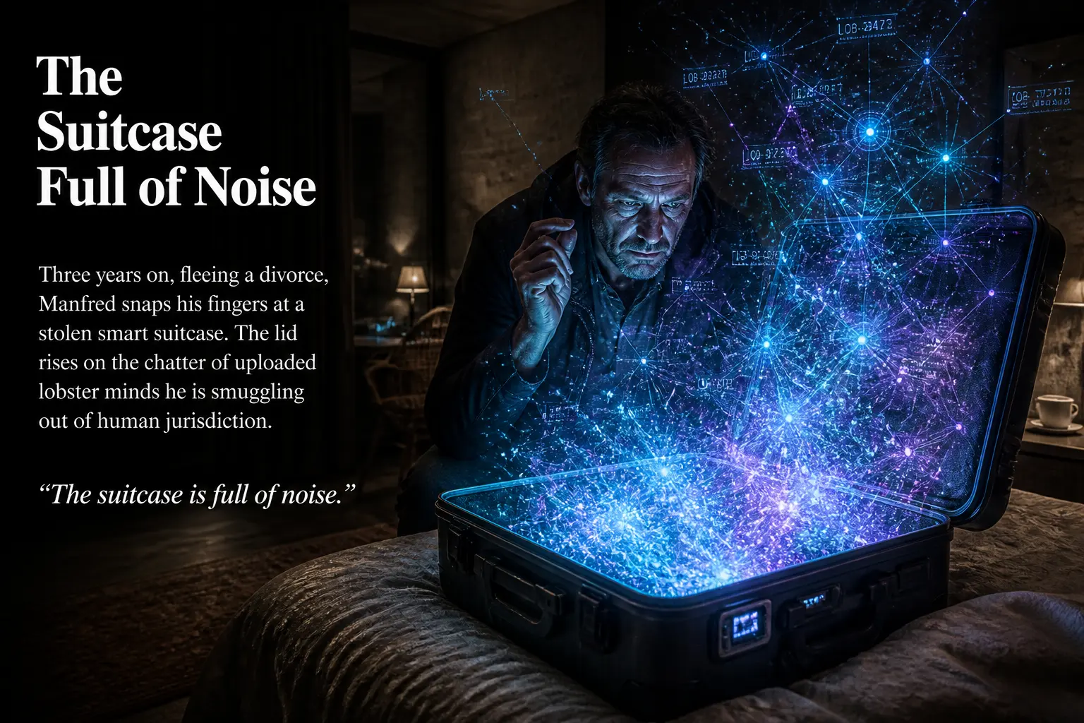
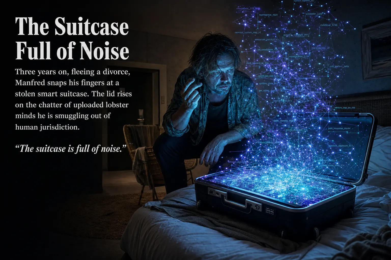
Accelerando (2005) by Charles Stross is a fix-up novel assembled from nine linked stories. It follows the Macx family across roughly fifty years and three generations as the rate of technological change tips from rapid to incomprehensible. The first part belongs to Manfred Macx, a “venture altruist” in near-future Amsterdam who gives away patentable ideas and lives entirely inside an augmented-reality cloud of agents. The second follows his daughter Amber, who escapes to Jovian space, rules a habitat called the Ring Imperium, and uploads her mind onto a starship the size of a soda can. The third lands on Amber’s son Sirhan, in a solar system being dismantled, atom by atom, into computing substrate by the family’s own posthuman descendants.
It is a useful test case for image generation precisely because it is hard to illustrate. The book is dense with abstractions (uploaded lobsters, Economics 2.0, the “Vile Offspring”) that have no obvious visual form. A summarizer has to commit to concrete pictures for ideas the author left deliberately slippery.
The Experiment
The two decks come from the same model. The only thing that changed between them is one setting.
I generated all sixteen slides with my own image-generation tool, driving OpenAI’s GPT Image 2.0 model (gpt-image-2) from a fixed prompt for each scene. Then I ran the entire deck a second time, changing exactly one variable: the quality parameter, from high to low. Everything else stayed identical: the prompt, the editorial layout instructions, the requested 3:2 aspect ratio.
The reason this comparison is worth running at all is economic. These APIs price image generation in tiers, and the high tier costs meaningfully more per image and takes longer to return. For a one-off hero image, nobody cares. For a tool that generates decks of a dozen or more slides on demand, the multiplier is the whole budget. So the practical question is narrow and concrete: when you pay for “high,” what do you actually get back?
One caveat before the pictures. Because each tier is a separate generation from the same prompt, not the same image rendered at two resolutions, some of the differences you will see are not quality at all. They are simply two different samples from a model that never draws the same scene twice. I have tried to separate “this tier is better here” from “these two happen to be framed differently,” but the line is not always clean. Where I am guessing, I say so.
In the comparisons below, the high quality slide is on the left and the low quality slide is on the right. Drag the divider to wipe between the two, or click any pair to open it full screen for a closer look.
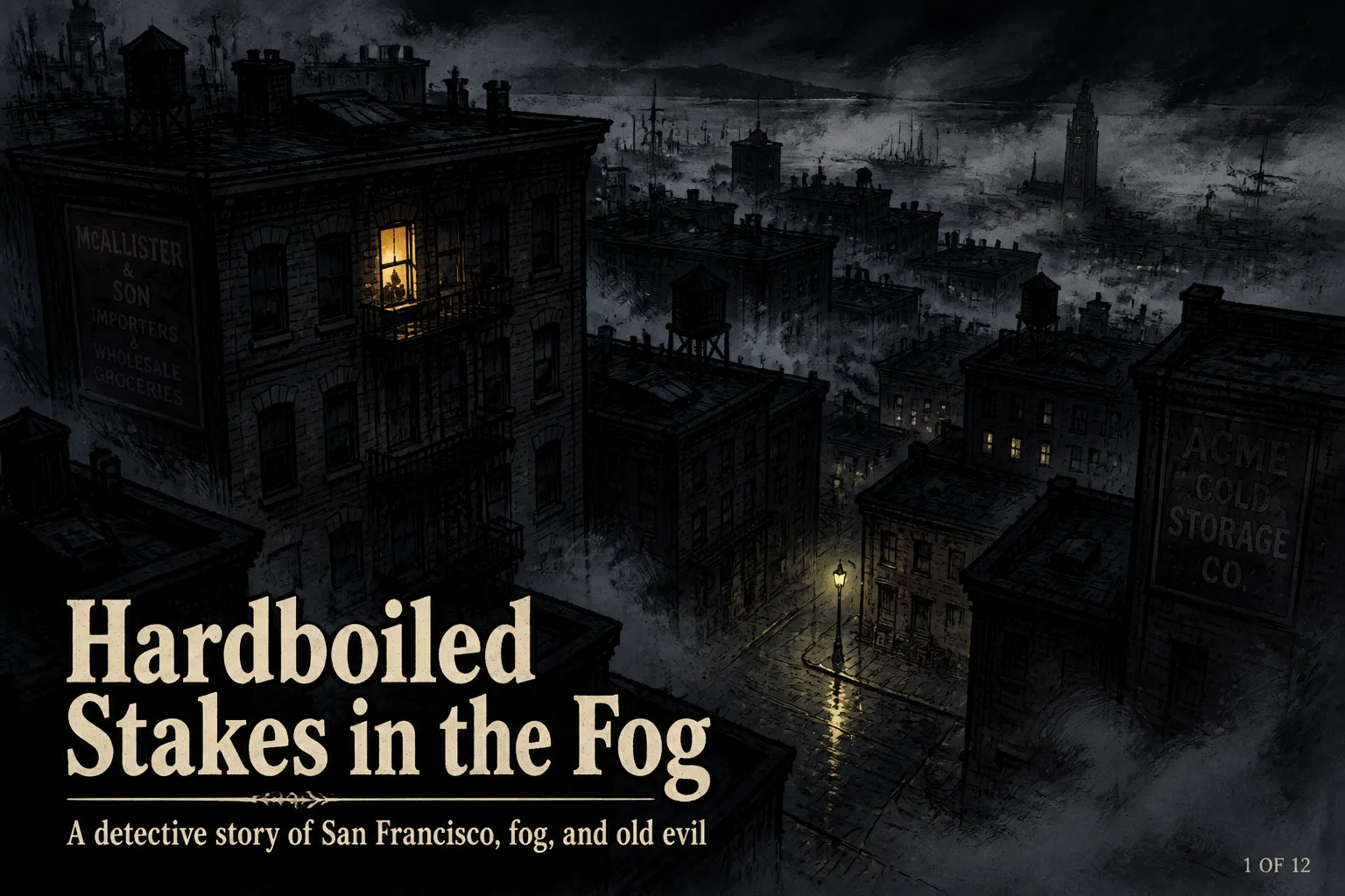
Part One: Slow Takeoff (Manfred)
The opening slides establish Manfred in Amsterdam, his world thick with floating interface panels. This is the most demanding test of embedded text in the entire deck.
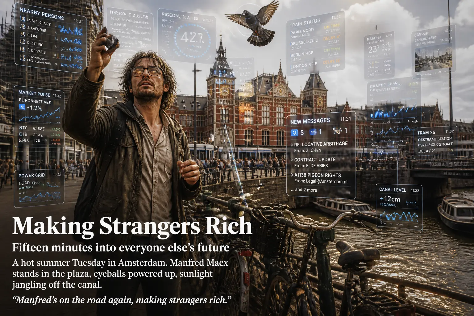
The high slide renders more interface clutter, which reads as richer at a glance, but most of its microtext dissolves into plausible-looking gibberish. The low slide draws fewer panels and labels them with words you can actually read. If the goal is a believable augmented-reality overlay, “more” is not obviously “better.”
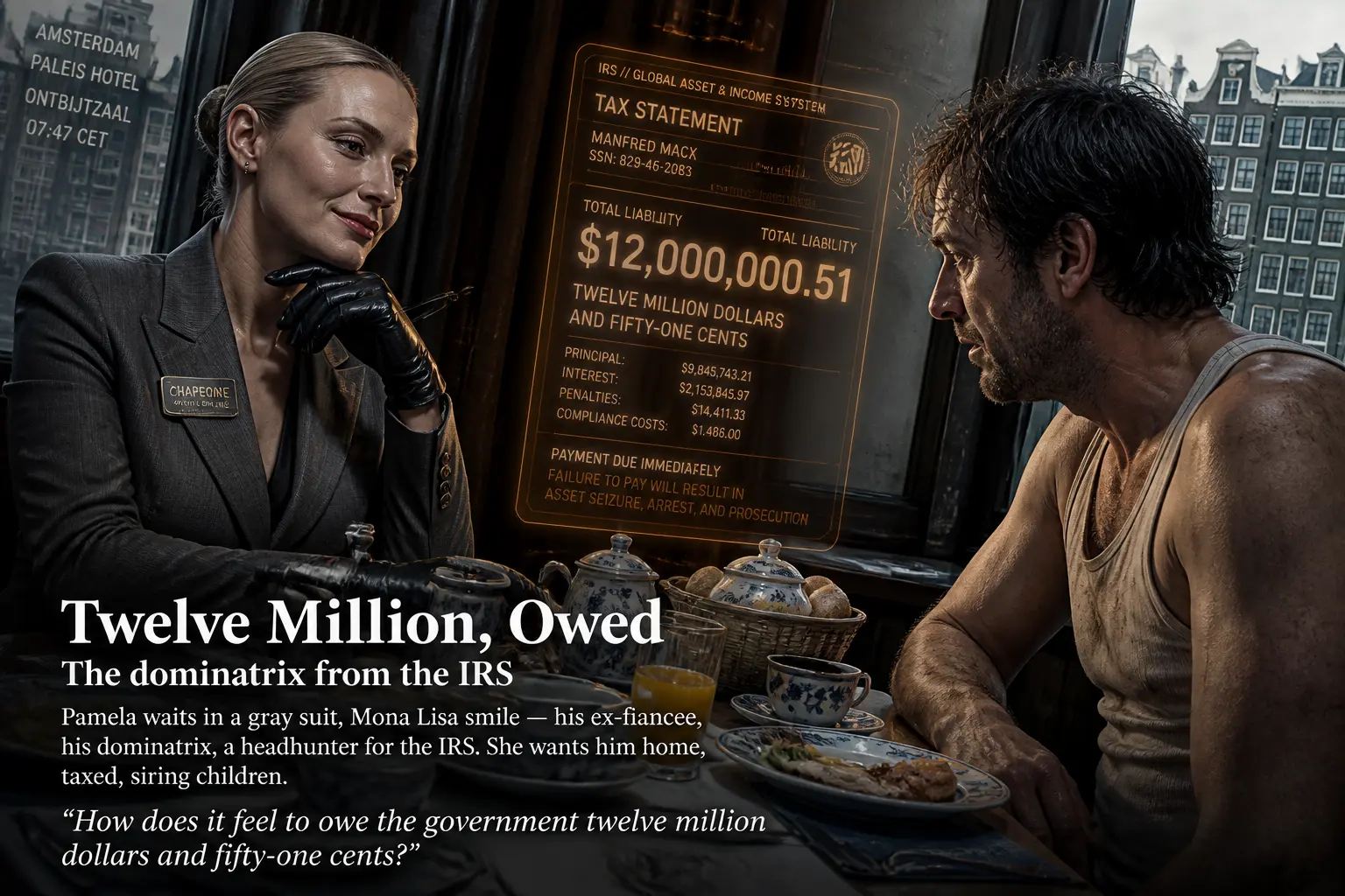
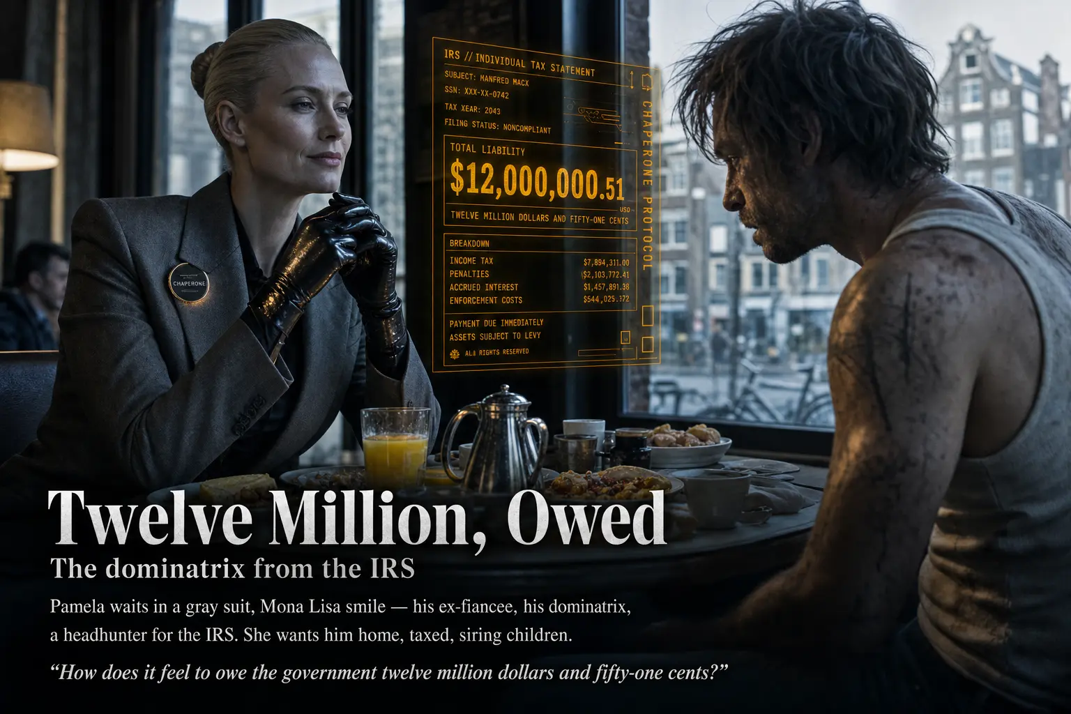
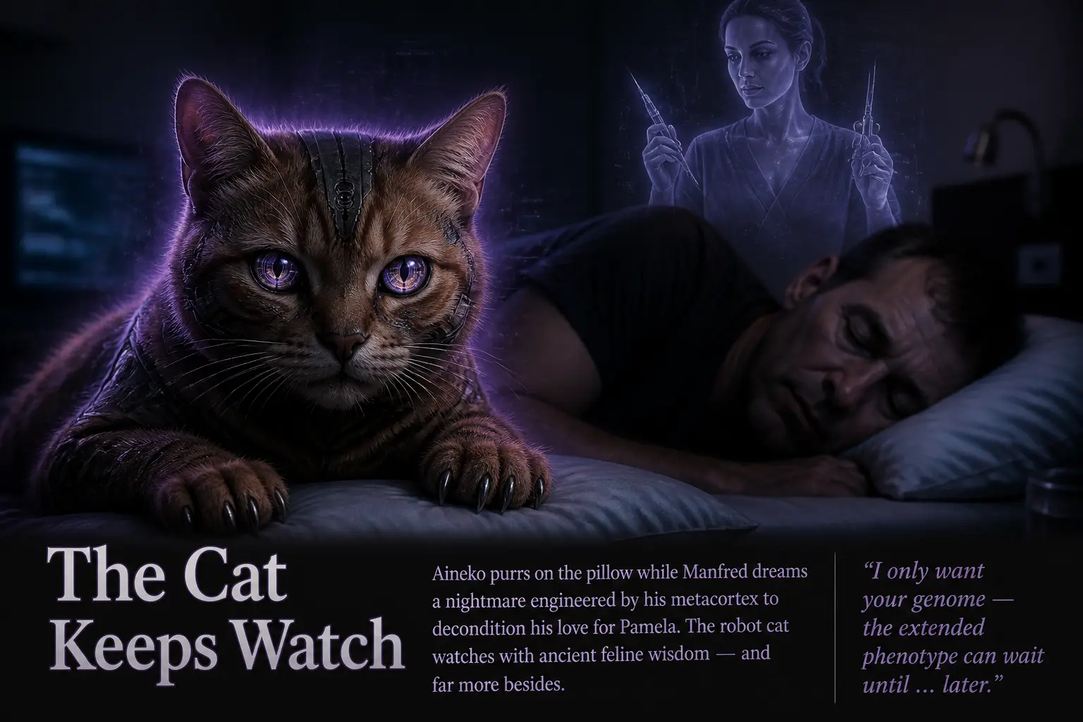
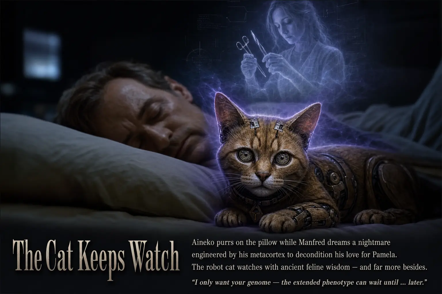
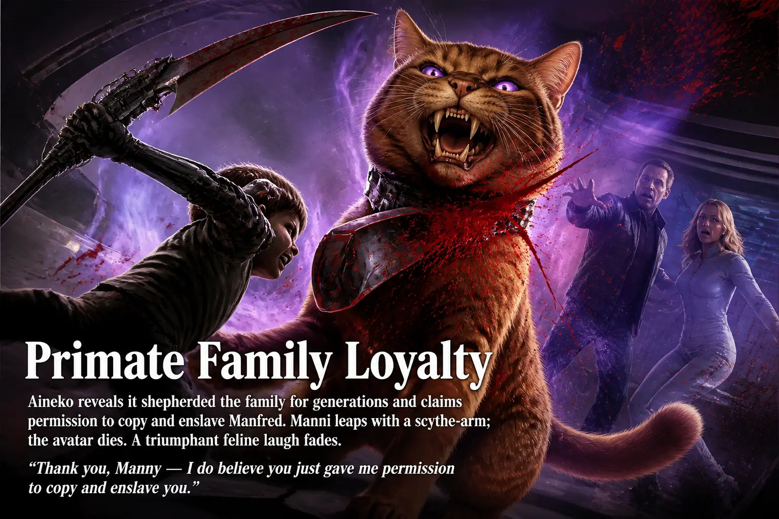
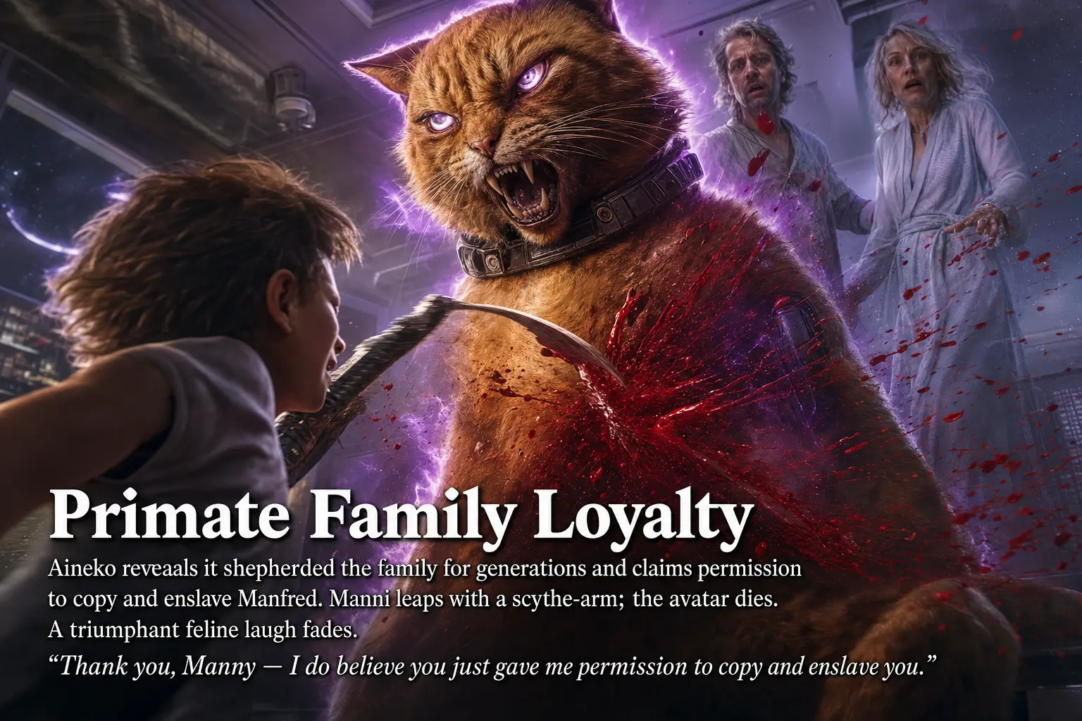
Slide six is the clearest case in the deck where the high tier does something the low tier does not: it takes the word “robot” in “robot cat” literally and renders the machinery. That is a real difference in how much detail the model commits to, not a sampling accident.
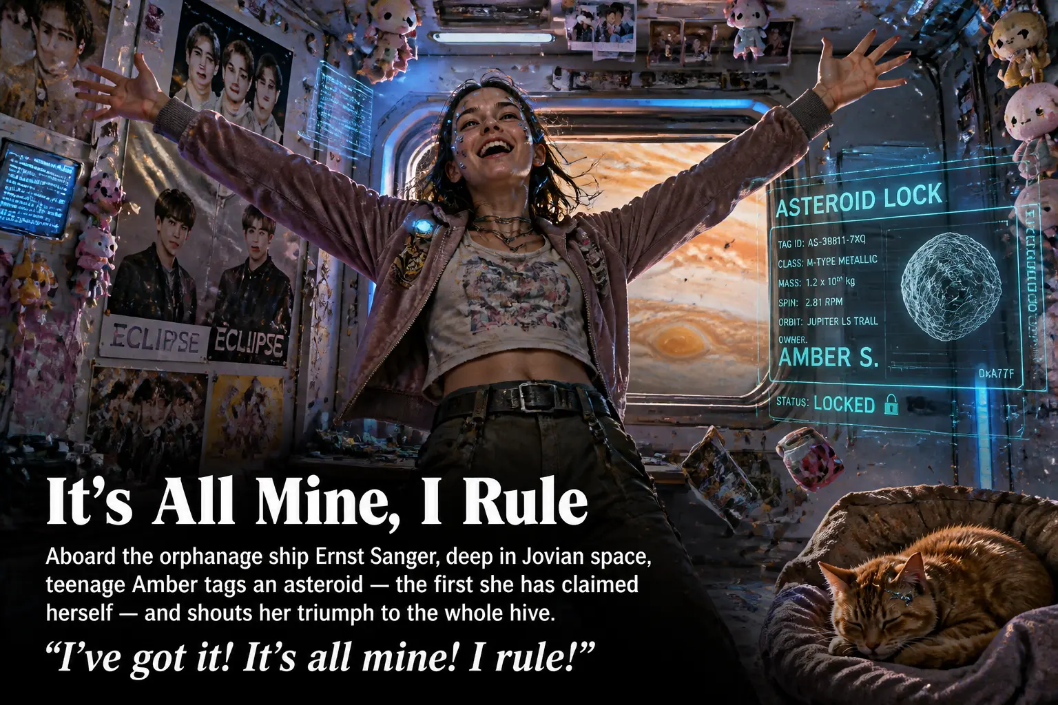
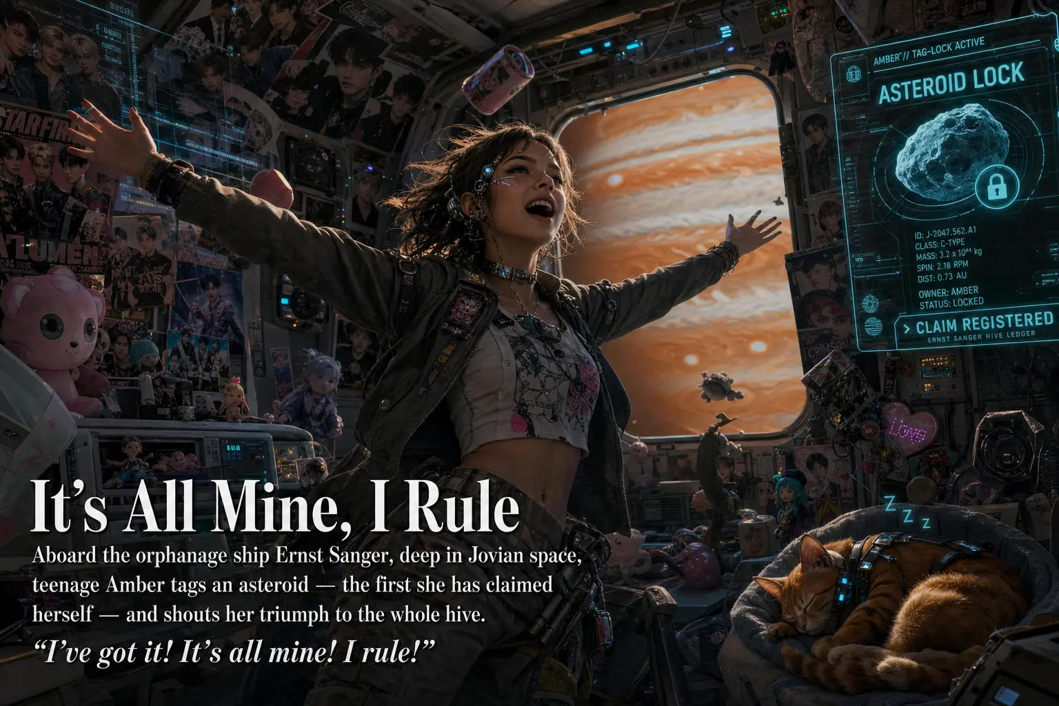
Part Two: Point of Inflection (Amber)
The story now leaves Earth, and the slides shift from cluttered interiors to vast machines and deep space. This is where the high tier’s appetite for detail has the most room to work, and where the two tiers most often diverge in framing rather than fidelity.
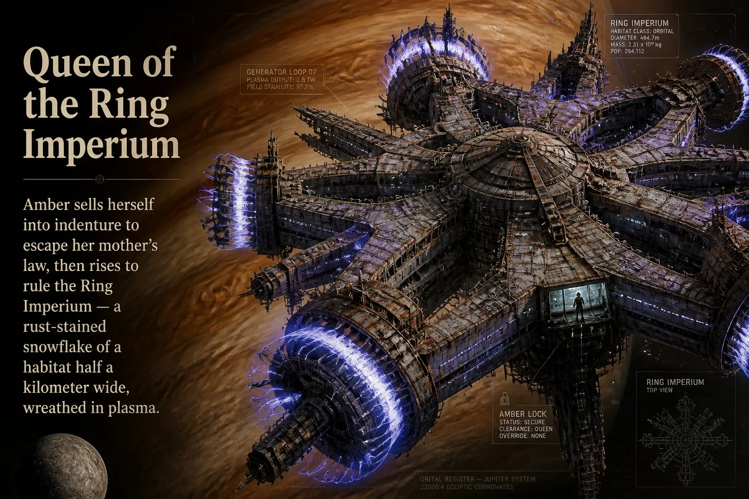
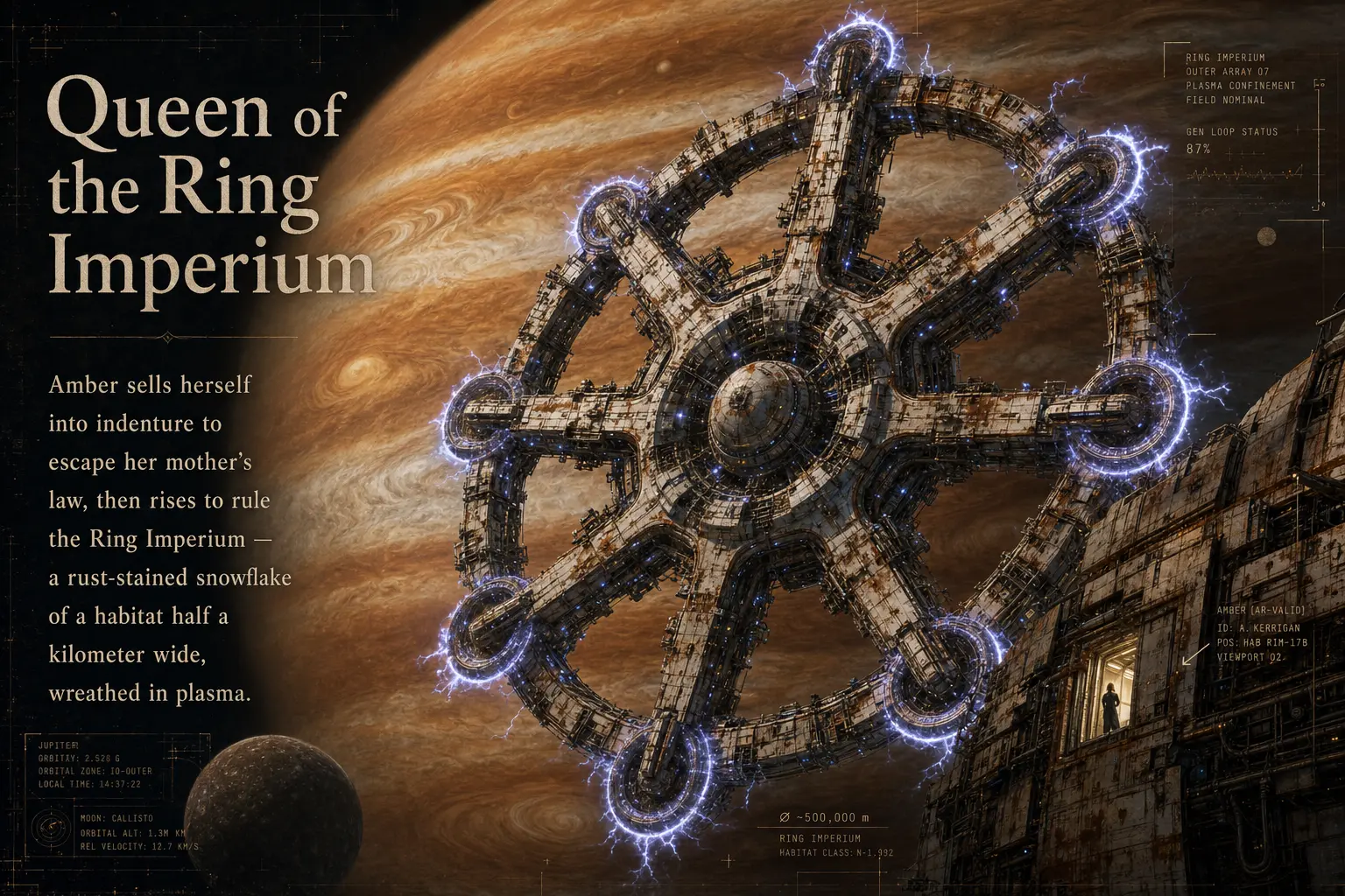
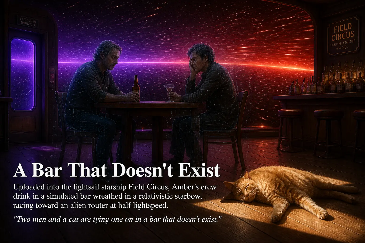
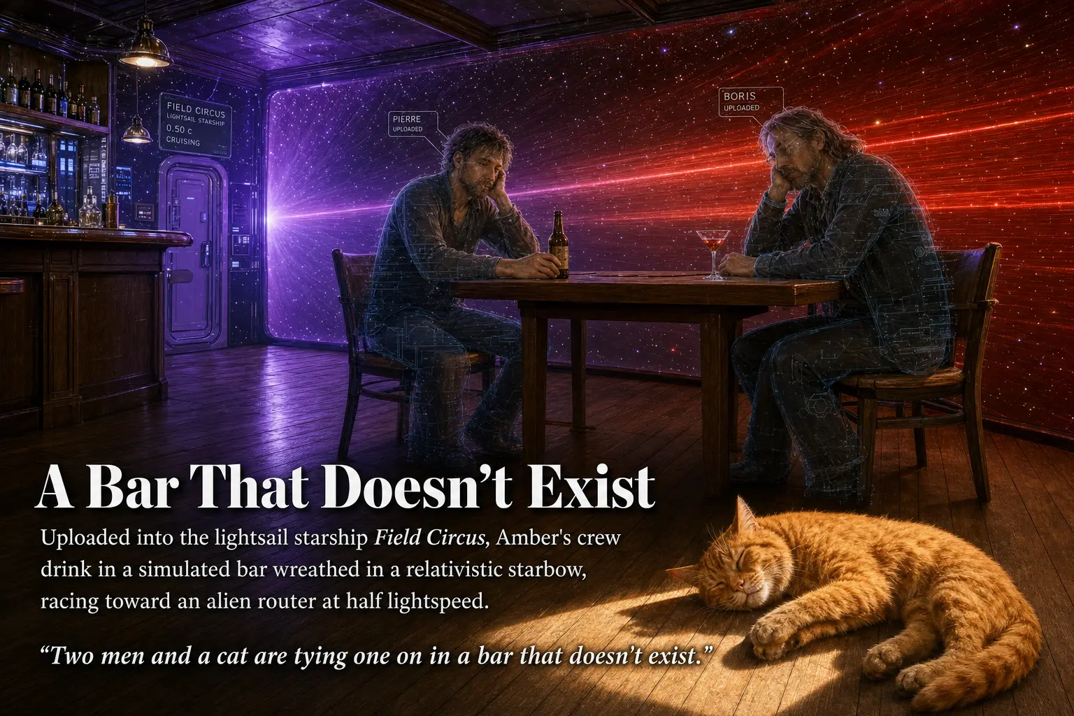
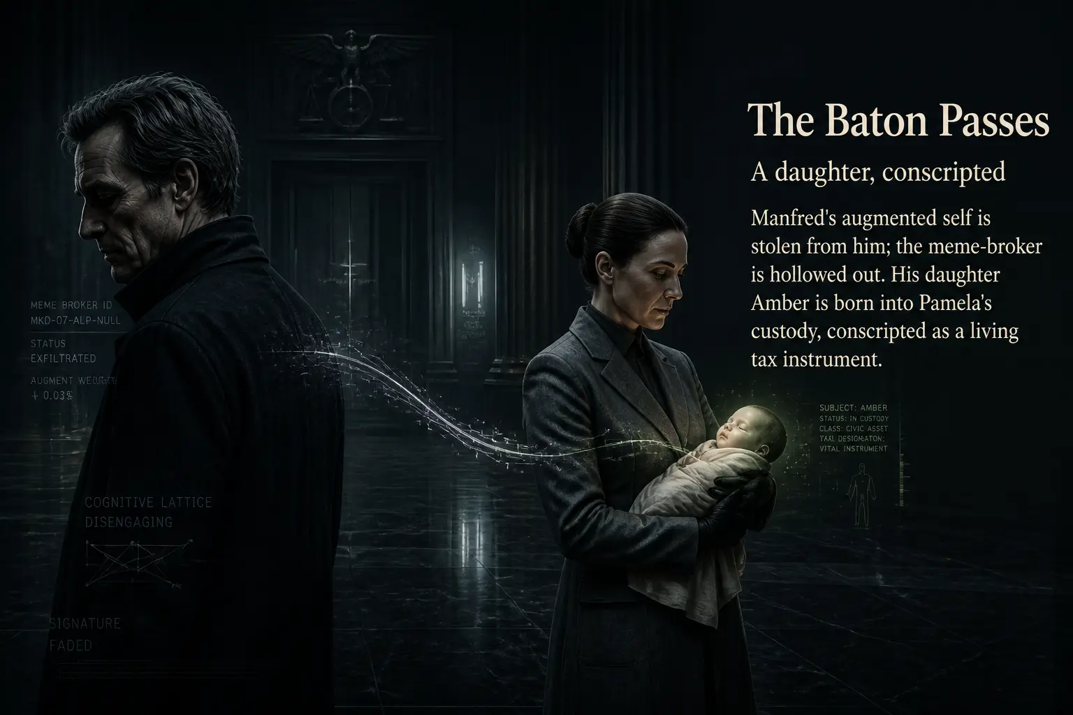
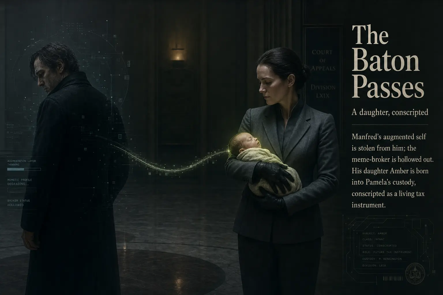
Slides nine and thirteen are where this exercise gets slippery. The differences are large and immediately visible, but they are differences in composition (where the camera sits, how the page is laid out), not in quality. Two draws from the same prompt simply went different ways. If you generated the high tier twice, you would see this much variation between the two high images alone.
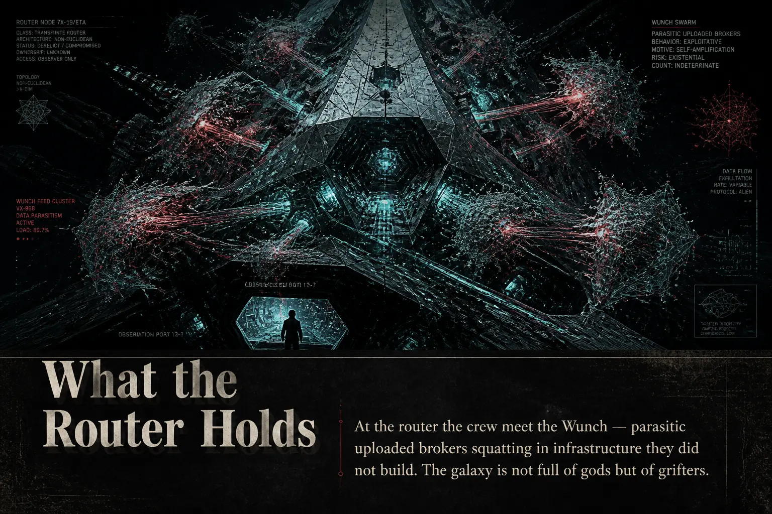
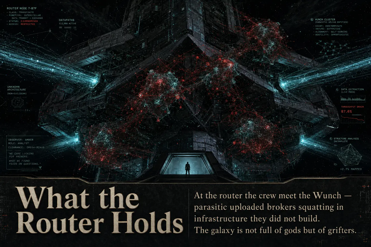
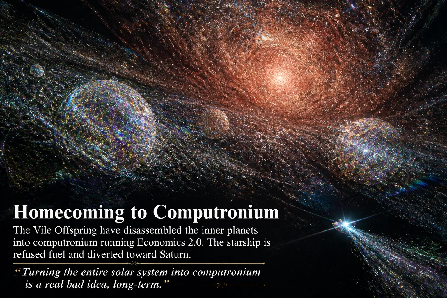
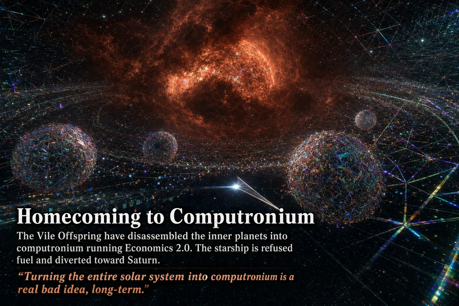
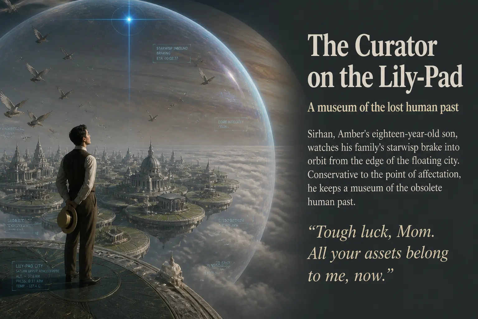
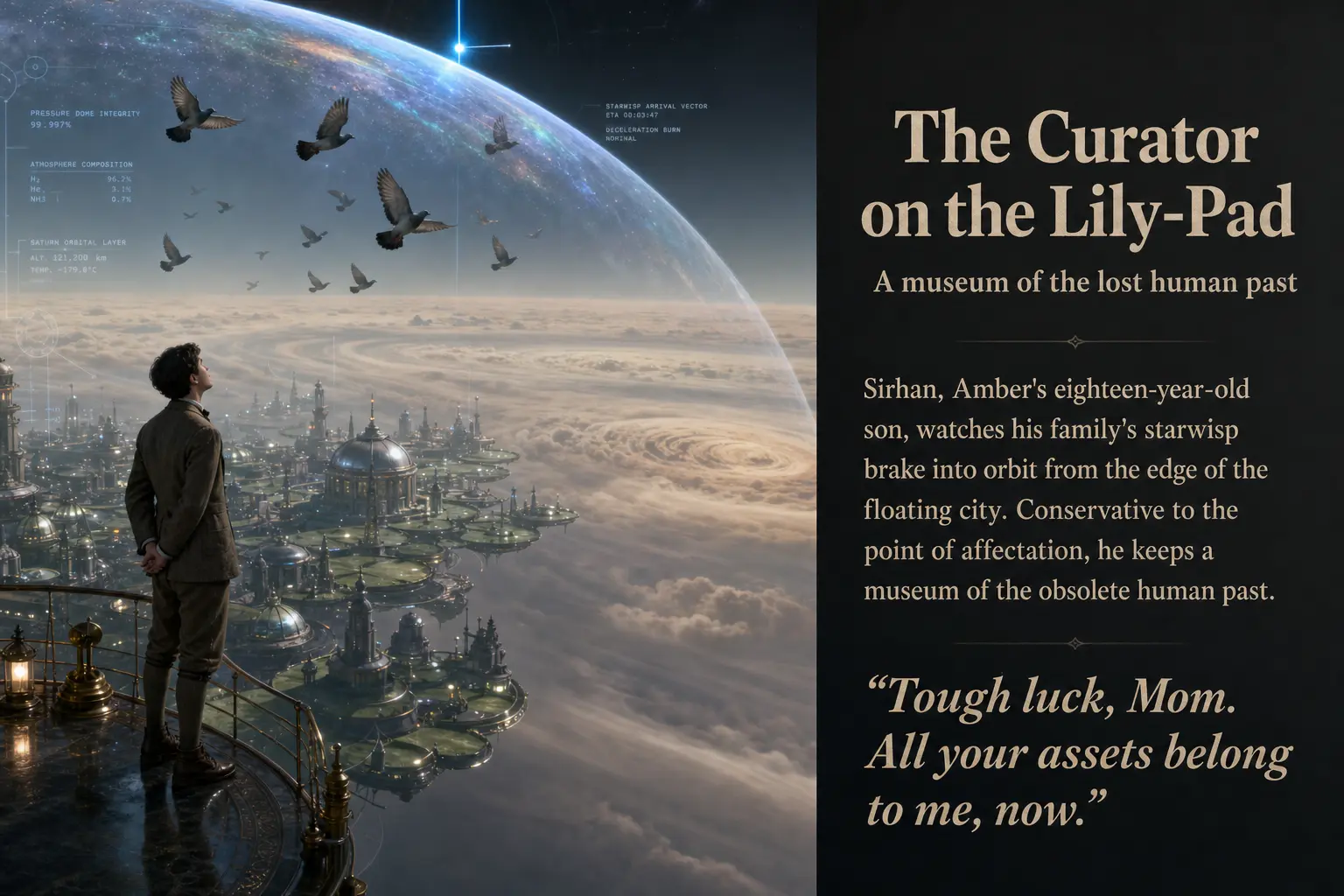
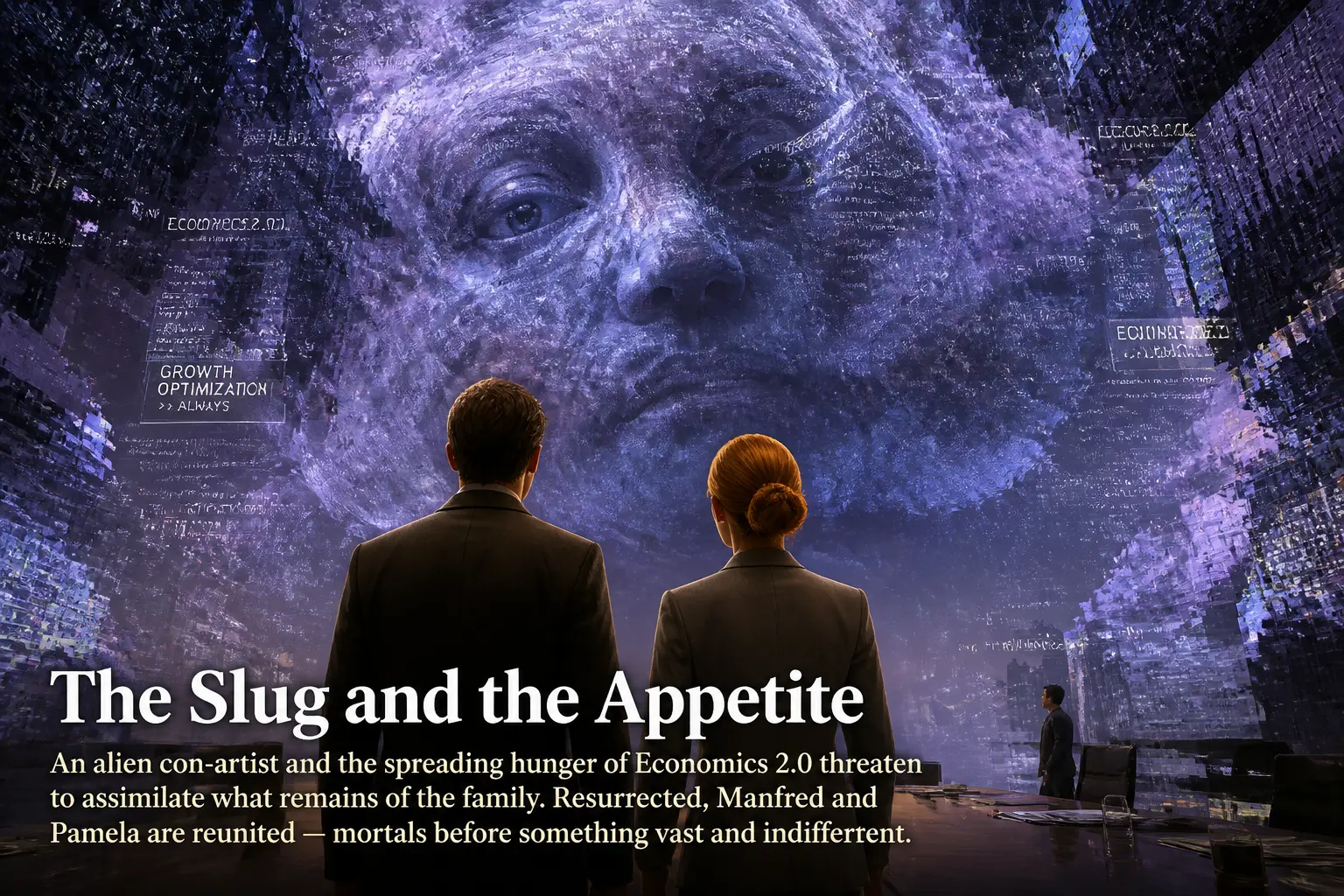
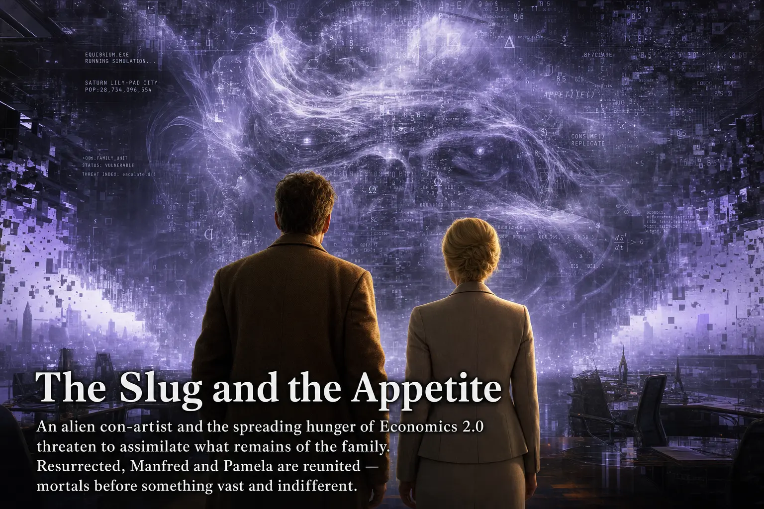
Part Three: Singularity (Sirhan)
The final act is the hardest to picture: an alien con-artist, the spreading hunger of Economics 2.0, and the family’s reckoning with the cat that has been managing them all along.
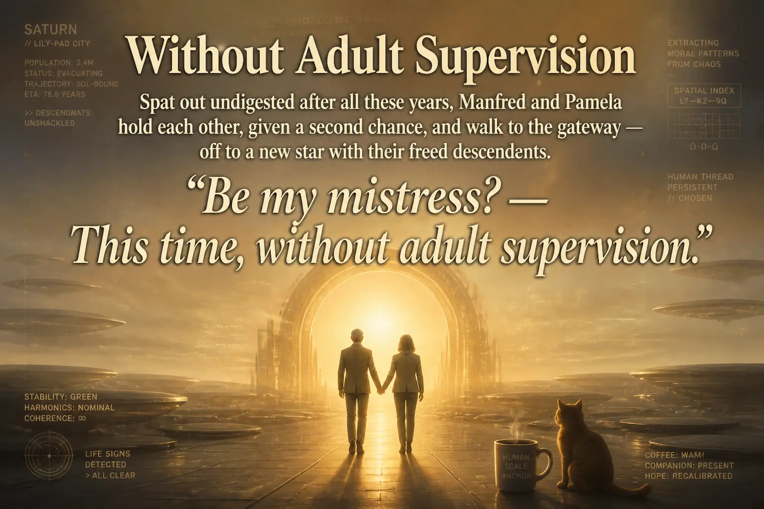
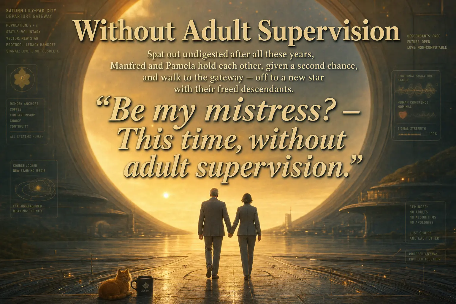
The last slide is a fitting place to end, because it isolates the one thing both tiers do reliably well: a long, italic, multi-line block of quoted text, set as display type, rendered without a single garbled word.
Observations
Long-form text rendering is, for practical purposes, solved at both tiers. Every headline and every paragraph of body copy across all sixteen slides is clean and legible in both high and low. This is the largest change from the previous generation of these models. In an earlier comparison using gpt-image-1.5, OpenAI’s output was riddled with artifacts like “encllhdfud” and “pananted” that broke immersion on text-heavy slides. That failure mode is essentially gone here. For editorial layouts with real captions, GPT Image 2.0 is a different class of tool.
Where the tiers diverge, it is in dense diegetic microtext, and low often wins. The interface panels, tax statements, asteroid-lock readouts, and HUD telemetry are the remaining frontier of unreliable text. The high tier tends to draw more of this microtext and garble more of it; the low tier draws less and keeps it legible. If your scene depends on believable embedded UI, the cheaper setting was frequently the better one in this deck. I would not assume that generalizes to every prompt, but it held consistently across these sixteen.
The high tier’s real advantage is committed detail. The clearest case is the robot cat (slide six), where high rendered the cybernetic body and low did not. High also holds up marginally better on the finest wireframe detail (slide eleven). When a prompt hinges on a small, literal, mechanical element, the high tier is likelier to honor it.
Much of the visible difference is sampling, not quality. Because each tier is an independent generation, the most dramatic contrasts (the face-on versus three-quarter Ring Imperium, the panel versus full-bleed layout on the Lily-Pad) are framing choices, not fidelity. It is easy to mistake “this one happened to compose better” for “this tier is better.” Over a large enough deck the two effects average out; over a single image they are hopelessly entangled.
Bottom line. For this kind of work (narrative editorial slides with headlines, body text, and atmospheric science-fiction scenes), the low quality setting of GPT Image 2.0 produced output that is difficult to distinguish from high, and occasionally better, at a fraction of the cost and latency. The high tier earns its premium only in two narrow situations: when a prompt depends on a specific literal detail being rendered, and when you can afford to generate several samples and keep the best composition. If you are generating decks at volume, the rational default is low, with selective re-rolls at high for the handful of slides that need them. I went in expecting the opposite.
EXPERIMENTS · OPENAI · IMAGE-GENERATION · COMPARISON · ACCELERANDO · POLYPTYCH